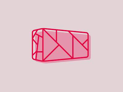
Illustration Style Tests: Polkaprint Geometry
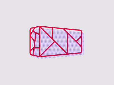
Seeing as I'm borrowing the concepts of overprint/misregistration from the print world, why not go one step further and incorporate halftone dots?
This does start to moiré at smaller sizes (@2x please), or just get really noisy and annoying, but I kind of like the "messiness" of the dots being a bit unpredictable and cut off in places.