Tubik Studio | Ice
Hello mates!
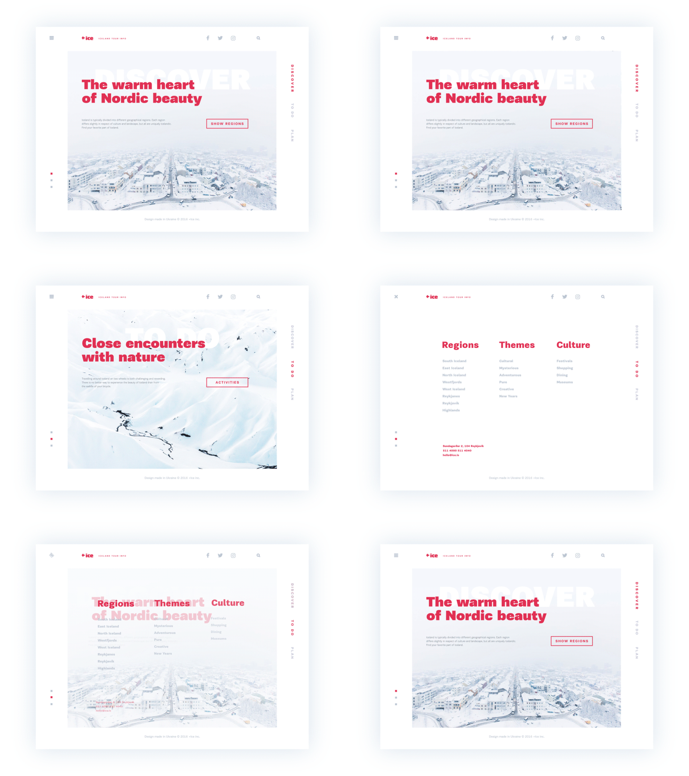
Let me introduce one more of my works to you. For most people traveling is a reliable source of inspiration and getting new impressions. I am not an exception and this time I have prepared a design concept for a website presenting travel destinations in Iceland. As well as in my previous shots, the idea again tries the best sides of minimalistic interface design. Working over the color palette, I have chosen the light background featuring the theme of Iceland and a contrastive headline. Thorough attention was paid to typography and composition as key sides of user-friendly minimalism enhancing usability, navigability and visual harmony transferring the spirit of the presented place. Animation shows transitions between pages to give the feeling of general design consistency.
To share more ideas we get working on design projects and concepts in Tubik Studio, we regularly update Tubik Blog with new articles. The latest one is focused on the aspect of benefits of dark background in UI. Welcome to join!


