Inbound.org New Profile Page
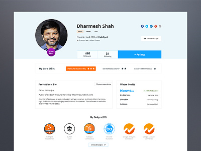
Profile page for the biggest marketing community out there: Inbound.org. I had the privilege to lead the UX/UI for this project most of 2015.
For this profile project I spent a lot of hours thinking, feeling, planning. The thing I was most excited about was Core Skills feature.
Each member can only list 3 marketing skills. Because that number is so small, they would choose carefully and make them super relevant. This is also a great gift for recruiters and people looking for a consultant because they can skim a lot of profiles in record time.
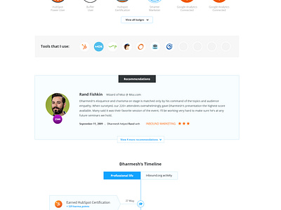
Another big thing is that you can get recommendations only for your core skills.
So long, jack of all trades! Each skill can be rated from 1 to 3 stars:
1 - just starting out
2 - intermediate
3 - expert
To validate a 3 star rating you also need to have a recommendation for that
particular skill. This has a double benefit: adds social prof to your profile
and helps Inbound community to grow.
The profile also features a visual timeline - you can view a full career in just a couple of seconds. It's also visual and fun to read, unlike those old school CVs.
If you want to find out more about running the UX Design for a huge community I've written an article about my experience here: https://inbound.org/blog/7-tough-lessons-i-learned-running-inbounds-ux-design
Check out the detailed design in attachments and don't forget to L :) .


