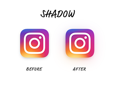
Shadow Tweak
One thing that I didn't like about the display of the new logo is the shadow, so made a little tweak.
Also, just like the new ID of Pepsi and Google, I'm confused at the beginning when I first saw this. But after working with the shadows for like 30 mins, I'm quite comfortable with the logo now.
More by Albert Wang View profile
Like
