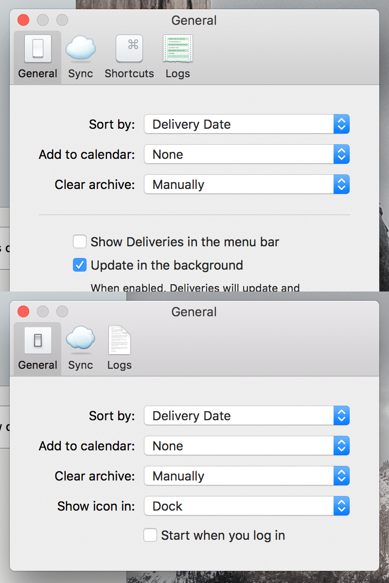
Preferences icons
I needed a new icon so of course I made four new icons. The new screen is first (with four icons), the old screen with three icons is after that for comparison.
The Shortcuts icon is the new one I actually needed, so I started with that. That forced me to keep looking at the Sync icon I made 5 years ago so of course I had to mess with that a bit, and then I thought a custom General icon would fit in better. Most people don't see the Logs icon unless they're beta testers, but the old icon was super lazy and I look at it all the time, so I figured I should make a real one to finish the set.
Thanks to @Alexa Grafera for streaming emoji drawing on Twitch recently. Watching her work got me thinking about some ways to improve my workflow:
Use Photoshop's "New Window for…" to show your file at multiple sizes. I know this is super basic but I've never been able to get in the habit of it. It's dumb, I spend so much time zooming in and out. Which seems like it works OK, but really, you need to be able to see the effects of subtle adjustments as you're making them. It's so much easier to get it perfect. After finally sticking with it on this project I can't imagine going back.
Vectors are important for hard edges but it's OK to paint. When Apple started putting Retina Displays on everything I got really insistent on making all my art extremely resizable. Shape layers everywhere. For shading I'd make a shape, add a gradient, sometimes multiple gradients, different types of layer effects, and so on. My original Sync icon was made like that. But there's really no reason not to just make a raster layer with a vector mask, and paint inside it. You get so much more control over the subtleties of the shading.
Layers are your pals, so make lots of them. I'm some kind of weirdo so my layers tend to be super organized. Don't get me wrong, I make a lot of layers, but if I'm shading a single object it tends to all be on one layer, for example. Which is cool but like, why have five layer pals when you could have twenty. As I was making these I tried to worry a little less about organization make new layers a bit more often. It gives you more flexibility as you're tweaking things—maybe this one change you made wasn't that great, but everything after it was perfect.
👍🏼
