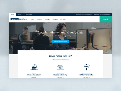
Danske Bank Beta '16
We are still working hard on the design for new Danske Bank website. Having the biggest bank in Denmark do a beta website is defiantly a challenge, but we all learn a lot.
Being in Beta means that we get valuable feedback from real costumers and users of the website. We launched the beta in december and the overall feedback was really good. Some of the feedback we got was that the website was a bit to white-spacy (who doesn't love white space?!). This lead us to a small redesign where we introduced a "digital paper" idea (I love analog names for UI stuff) where all the content will live.
The second biggest problem was that the users couldn't find the login button in the new design. We went all in on it and tested a couple shapes and colors. We ended up with a big green login button, which was the one that tested the best (and looked the best).
The website is still in beta and there is still a lot to do, but you can see the current state here: beta.danskebank.dk

