Anders Group Rebrand + Marketing Material Design

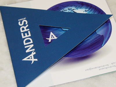
Anders Group turned 5 in 2015 and decided it was time for a new logo. Their initial logo was designed quickly so that their business could be launched. In this redesign the blue color in their original logo was worked into this design. This design is cleaner & sleeker than their original design and has several variations that can be used on a variety of different mediums. This particular image is a shot of their brochure they pass out at events. It is a square tri-fold with a triangle front cover that is die cut to show their "A" icon.