Personal Site Template
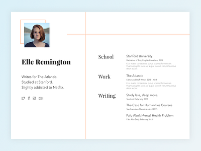
Mostly just an experiment with effectively using lines. In this case, I wanted to draw attention to the headshot (square), divide the two sections (vertical line), and cut the white space (horizontal line). I usually do flat design so it was fun to play with a gradient for once.
More by Jonathan Osborn View profile
Like

