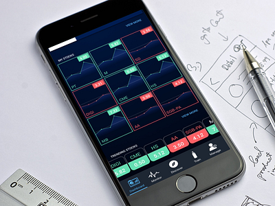
Investment App
This is one of the examples of nice UI, but bad UX. I'm trying to layout nice graphs to display all stocks that user have bought. Later I found out that this layout doesn't work at all because user want to see more than just the current price.
So yeah, back to drawing board. Hhmm
More by VLT Labs View profile
Like
