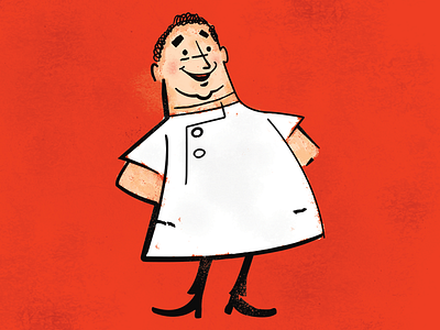
The Butcher
I have always loved the squeaky-clean illustration aesthetic of mid-century advertising art. It was always pushing an American optimism and can-do enthusiasm no matter what the product was.
In this piece I wanted to speak to what lies beneath that veneer. By combining cheerful line art illustration with darker implication, this piece comes across as equal parts Dexter's Laboratory and Dexter.
I want to give a shout out to @RetroSupply and Brad Woodard for the various AI and PS brush packs I used here. Really, really good stuff.
More by Ben Howes View profile
Like
