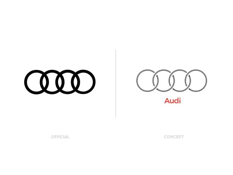
Audi - Official Redesign vs Concept
Some of you may have noticed a huge different visiting the audi website recently. At the first view its not obvious, but its a huge difference for the Corporate Identity of the brand... The LOGO! Audi revealed their new company logo and voila... it's flat.
Those of you who are following my work, may have noticed i have recently made a small project called "Logo Redesign Concept" where i redesigned some well known logos. One of them was a Audi Redesign concept, so its pretty funny they come up with a new logo shortly after my project ;)
So i decided to oppose both logos. Both logos are going in the same direction but they executed differently.
- My Concept -
With my concept I clearly went the flat way too, of couse. But i tried to keep some depht and recognizable elements like the Audi red and the smooth grey tone. I also tried to make it more interesting and dynamic by adding some space between the touching rings. So you dont have a static feeling anymore. I tried kinda to evolve the brand instead of just simplifying it to the fullest.
- The official redesign -
So what am i thinking about it? Chosing black is pretty cool and its fits the character of some of their mean sport cars. But i have a big issue and you have to tell me if you see it too.
The more i look at it, the more my eyes hurt. It's not just a dislike! its more because it looks like someone added way to much negative kerning to it. My eyes trying to seperate each rings into back- and foreground permanently, which is exausting for the eyes. It would be much better coming up with an interesting new idea like some spaces or one ring negative/red?... than simplifying it to the basic, which is not working very well with this kind of object. Without that issue, i think its an overall solid piece.
But thats my personal opinion even im very open to new stuff. But im recently unsatisfied with the obvious way of redesigns. I think Coca-Cola is a good exaple of not going with design trends.
- But now's your part! -
What do you guys think about the new logo and which one do you prefer? Feel free to share your thoughs about the flat wave.
