Highrise Logo Refresh
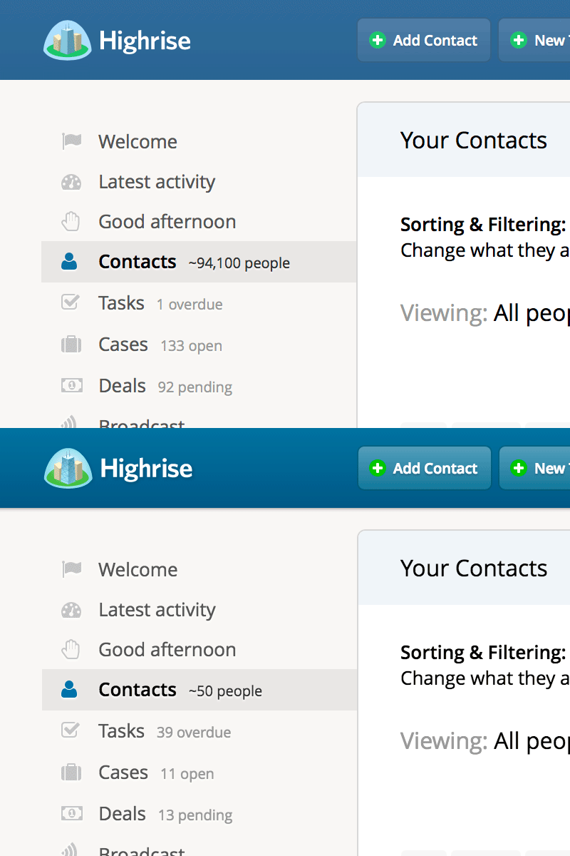
Sneaking a bit of a logo refresh into some other header theme changes.
The new one loses the gradients and drop-shadow on the type and has a better (in my opinion) perspective for the 3D. The new implementation is now also SVG-based and the colors are tweaked based on the chosen header color theme.
More by Grant Blakeman View profile
Like
