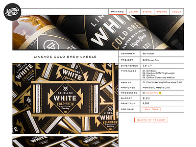
Mama's Sauce Redesign
I got the lucky privilege of working with Nick Sambrato and the guys at Mama’s Sauce in designing and building their new platform. It’s a heavily-typographic design influenced by designers like Zwart and Tschichold during the height of letterpress—Futura and engravers grotesques. The minimal styling takes a back seat to their colorful, vibrant, masterful print work.
The site was designed by and for print nerds. It’s a growing shrine to spot color print, built with great photography, in-depth print details, and even a knowledgebase that’s a master class in itself of print design. The grids that make up the site are a nod to Mama’s day-to-day world of registration, planning, and exactness that are behind every print they make.
It’s a work in progress, and just the ground level they’ll be building up from this year. They’ve really taken to and run with the whole printing database and have taken care to spec out everything they’ve printed. And this is all from only within the past few months!
I’m making some typography updates soon; would love some critique from you guys on making it feel “more Mama,” or anything you’d like to see from the site in the future.


