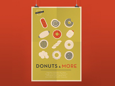
Donut Shop Poster Series
This project was very interesting for me to do because I was defining a brand through poster design.
A local donut shop reached out to me to help them distinguish their shop from any other in the area. We decided a mid-century modern theme would be different and create an inviting, modern environment for customers.
The posters reflect the classic posters from the era through illustration and strong typography. I loved playing with the classic Chairs by Eames poster and translating it to donuts :)
More by Rebecca Black View profile
Like


