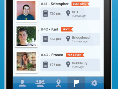
Beaconize UI Mockup 2
Hey Dribbblers,
I recently posted a shot of my app interface and people were saying it was too gray. Now I added some blue and some orange. But I dont like it. Can anyone suggest some colours? Preferably shades of orange and blue.
Thanks!!
More by Karl Clement View profile
Like
