New Project
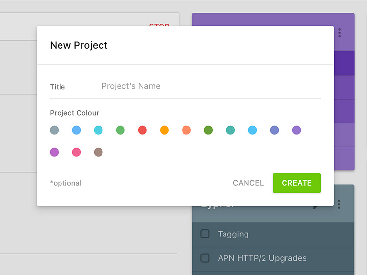
The "New Project" has evolved significantly over the past two months. It's gone from the bare-bones 0 interactions; to a fancy menu showing itself when tapping on "project colour". Then, it's finally take this form.
I'm quite liking this. I've always disliked the idea of "hiding" a view that's kind of significant to the flow of the process or the entire app.
Let me know your thoughts.
More by Dezine Zync Studios View profile
Like
