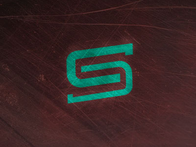
Personal Monogram
Thought I'd throw this up here because I realized I hadn't actually put my personal logo on here. I've gone through many iterations over 2-3 years, but am fairly happy with this. Simple idea, just a C, flipped over, to create an S in negative space. The top C is thicker, I kind of like it like that because it makes that C stand out. What do you guys think?
More by Colin Stasuik View profile
Like
