TasteBud Parties
Looks like I post no UI work here. Oops.
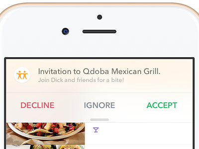
Been working with TasteBud for a little over two years. This screen's from an exploration about a month ago, where we were exploring ways to drive user behavior towards eating in small parties.
Inviting users to parties became a problem — we had no cell numbers associated with accounts, and not all users, though the majority, had enabled push notifications. So, in the Parties exploration, I included options for an in-app style of notification, trying to mirror the native iOS Notification style, while maintaining TasteBud's palette and typography, allowing a feeling of relevance to the overlay, rather than that of a system interruption.
The full exploration is attached. Various elements in here aren't pixel perfect, as they're pulled from testing versions — i.e. the tab bar. Most of this was made around unique limitations and within a ship-first mentality, but I'm glad to see what the team's accomplished thus far.
A resolute 👍 to anyone who recognizes the names used.

