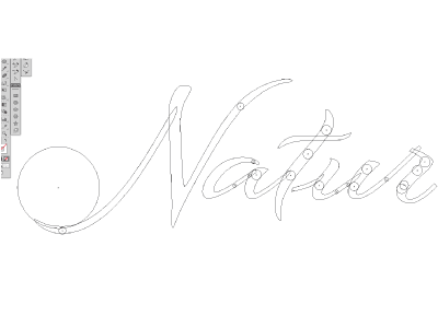
Logo vector refining "The Kraken"
I got back to the drawing desk this morning - with a fresh eye - dealing again with spacing and boldness issues. I call it now the "kraken-phase" where I draw one circle into a 'stroke-shape' and copy it into the other ones as stroke-boldness reference. In the end, the letters are sprinkled with circles looking like the suction cups of krakens. Though kraken is not really fun and plus time consuming I would love to learn some more efficient processes to get to even boldness more quicker. Release the kraken ;) Thanks!
More by Chris Pedersoli View profile
Like

