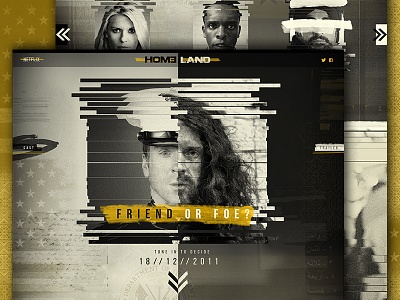
Homeland Promo Site Concept
I've been watching Homeland recently and decided to create a promotional launch site for series one as my first web concept. Using the stark contrast between black and white the design creates two opposing sides, however much like the show the lines begin to blur.
Over the duration of the series the information about each of the characters is updated and more are revealed, helping you to decide for yourself - who is friend and who is foe...
More by Unseen Studio® View profile
Like

