FlexTime Buttons

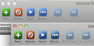
My first share here on Dribbble … I'm a coder first, by far. I made my own buttons for one of my apps, FlexTime. It's been a few years since they were made, and looking at them now (top) they seem too saturated and too faded. I tried to just adjust them a bit with desaturate and increasing the contrast (bottom), to make them pop a bit and ideally be less visually glaring.
I know they are also a little clunky on the edges, and don't blend in well to the grey background, especially on the top border.
There's probably an argument to be made against the blatant color coding of each button. It was kind of haphazard. The last thing I want is a "windows-like" saturated color look, but working with such basic symbolic buttons it felt useful to have some color distinctions.