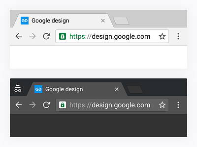
Chrome desktop Material Design
Chrome 50 is starting to roll out and with its Chrome OS version comes the Material design revamp of the Core UI.
A year in the making, the MD redesign of Chrome consists in a complete revamp of how we implement the Core UI.
Beyond a flatter, sharper and lighter design, it is a huge engineering feat. Chrome is now rendered fully programmatically including iconography, effectively removing the ~1200 png assets we were maintaining before. It also allows us to deliver a better rendering for a wide range of PPI configuration. In addition we made the following changes:
- New default theme.
- Complete overhaul of the Incognito theme with a new dark color.
- Complete revamp of tab shapes, icons, and omnibox to match mobile.
- Introducing Material Design ripples and morphing buttons states.
- New color, more accessible color scheme.
- New info bars and buttons.
Last but not least, Chrome comes with an alternate layout called "hybrid". It offers a more comfortable layout for touch-enabled and convertibles devices without compromising the productivity aspect of Chrome. This will be activated by default on touchscreen Chromebooks.
If you want to try Chrome MD on Windows or Mac, simply download Chrome Canary and in about:flags, turn on "Material design in the browser's top chrome". Careful, these are still work in progress.
Check the Normal vs Hybrid preview
Check the updated Chrome browser family
You can see more on my dedicated portfolio page.


