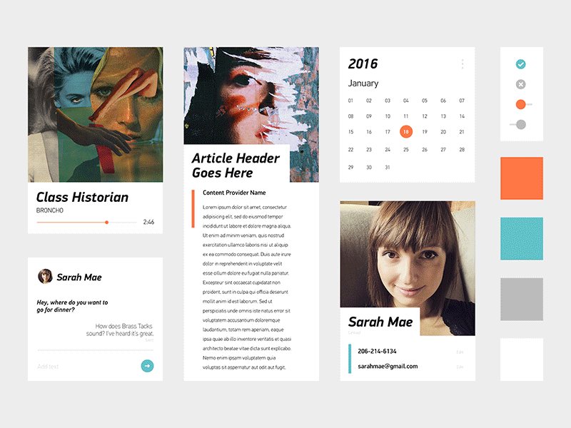
Sense 8 / Early Concepts
Very first set of visual concepts that I created for Sense 8 (for the HTC 10). These were made almost a year and a half ago. They were created quickly and abstractly, exploring color, type, layout, button controls, graphical elements, etc. They acted almost as moodboards to give us a general feel for various visual directions. I really like where they were heading, and if anything, they were inspiring to our team moving forward. We ultimately went with a more Stock look for Sense and stuck closely to what Google has been doing with Material Design.
One of our sound designers, Andrew Champlin, created custom music tracks to go along with each of our concepts. They were quite incredible, especially considering he did them in a day or two.
Check out the attachments for high-res versions and let me know what you think of these in the comments.


