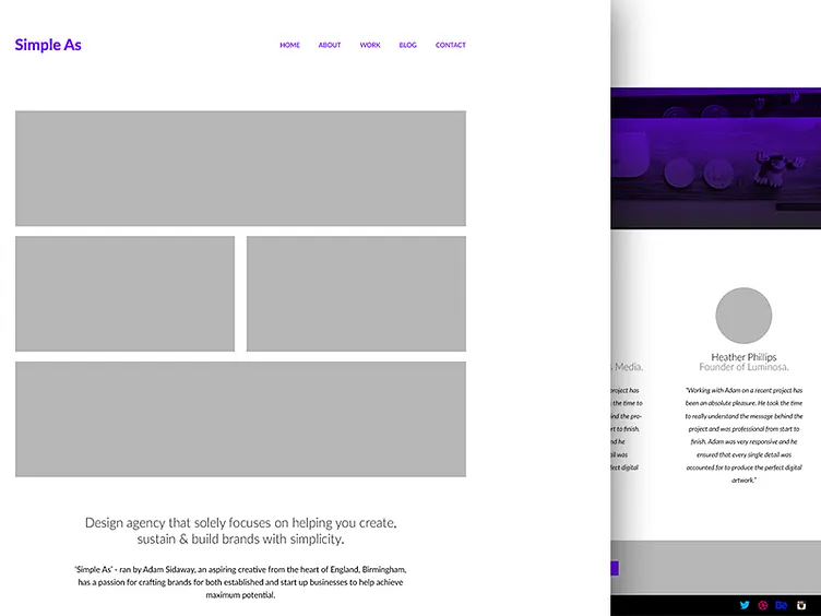
Home Page Refined
Decided to refine the home page design a little bit more, felt a bit of vibrance was needed with the colour palette so I'm playing around with different colours at the moment to go alongside your standard black & white.
More development needed before bringing this to life.
View behind the scenes shots of my work, WIP & personal photography on my Instagram.
More by Adam Sidaway View profile
Like

