Blog Article - Print Style Layout
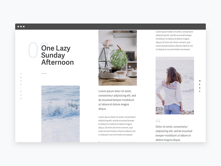
This shot was used to get some practice at designing up a blog post article similar to a print design article with the use of vertical text and heavy use of the grid.
Images sourced from Death to the Stock Photo and font used was Adelle Sans to make the text feel more friendly/casual to catch the sleepy Sunday afternoon feeling.
Feedback welcome!
More by Ben Low View profile
Like
