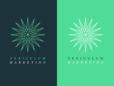
Periculum Marketing
A logo option that didn't make the final cut. The strategic thought comes from one of the latin meanings of the name of the firm, Risk. The repeated, round symbol, comes from peri – which means all-around. Since the firm concentrates on restaurants, the pointed edges link to the pufferfish – a dangerous, risky Japanese dish.
More by Linh Pham View profile
Like
