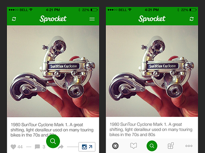
Sprocket iOS 1.4 Navigation
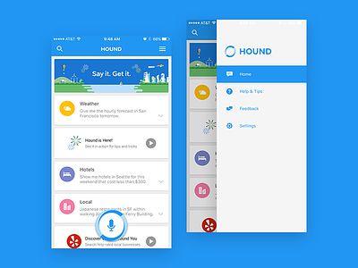
Torn between these two navigation patterns: the standard iOS Tab Bar or the Inverted Drawer I designed for SoundHound/Hound on iOS. This drawer takes up the side opposite side of the screen from swipe/force-swipe to go back and would work deeper in the hierarchy like Androids nav.
Benefits of tab bar:
easy discovery
easy to reach
can be reached with one action
leverages learned iOS spacial memory
Benefits of inverted drawer & floating search:
focus on search
impossible to hit not search nav item
bigger search tap target
more items (& features?) can fit sequentially in inverted drawer
Thoughts?
More by Retrographic View profile
Like


