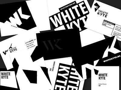
White Kyte
First attempt to design the Stationary for a Brand called White Kyte. The intention was to keep it Bold, Black and White and with heavy impact. This is just a mashup of various Logo-Proporsals adapted on some Businesscards. Packaging studys coming soon.
More by Florian Unterholzner View profile
Like
