DailyUI // Day 5 : App Icon
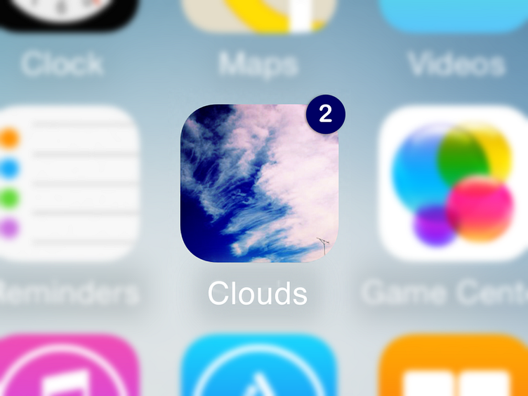
Most weather services use flat and illustrated app icons. I assume that’s because weather apps use illustrations to convey messages such as cloudy, thunder, lightning, sunny etc. This UI challenge started off with me making a ‘non flat or illustrated app icon’ but now I’m thinking if orthodox weather-communication icons can be challenged to look more realistic? I, for one think it could work! Would love to hear your thoughts!