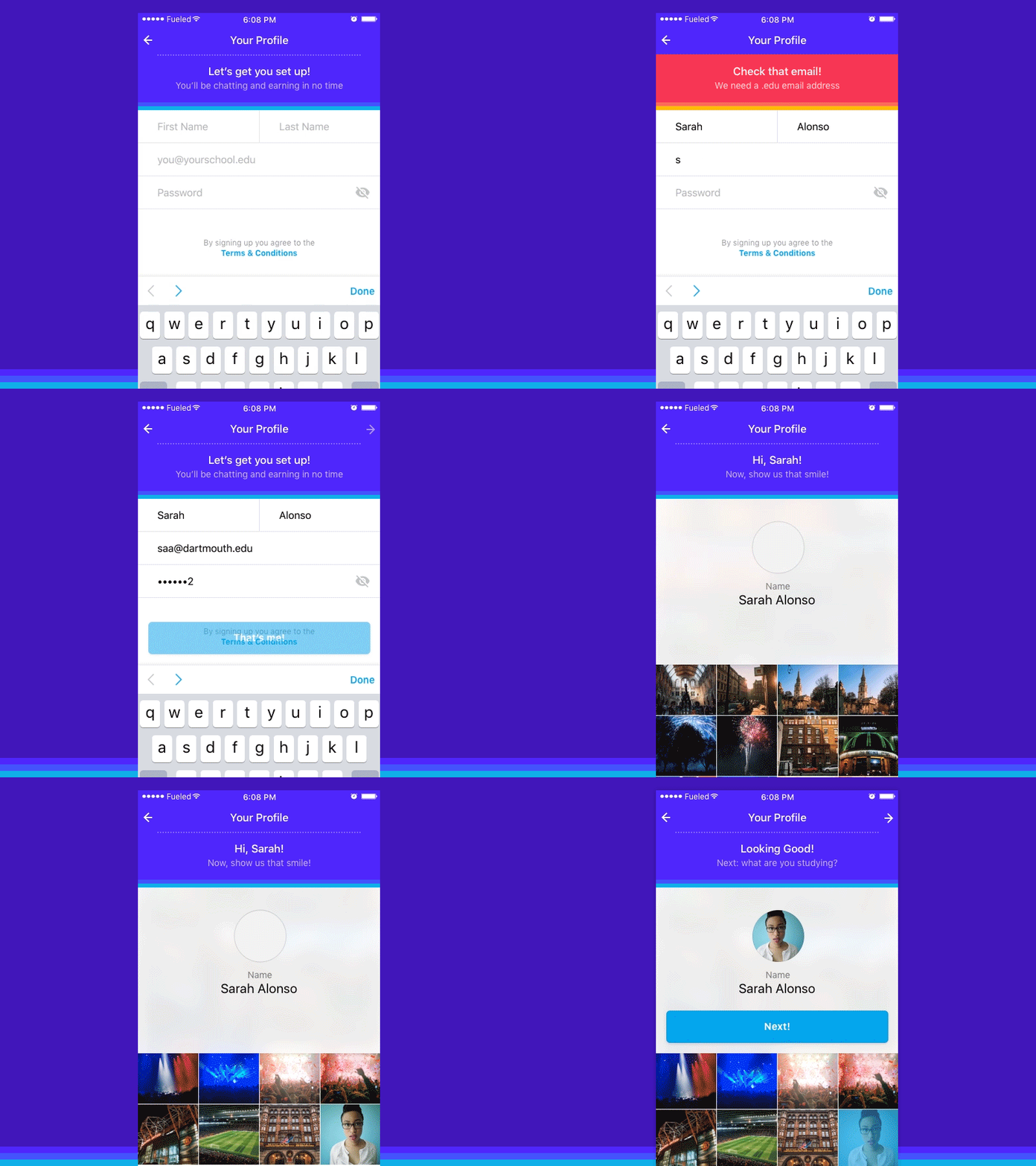
Profile Creation Flow
(View attachment for full effect & flow)
Some interaction design from late last year for an app aimed at university students.
There are parts of the account creation process that aren't inherently fun, and some also require a bit of extra messaging to be fully understood. Filling your profile out properly is key to having a good in-app experience, so we made some efforts to keep the process engaging. One way of doing this was using an "extended navbar" to house some short, informal messaging, as well as a way to introduce animation, convey progress.
attachment.mp4
5 MB
More by Fueled View profile
Like
