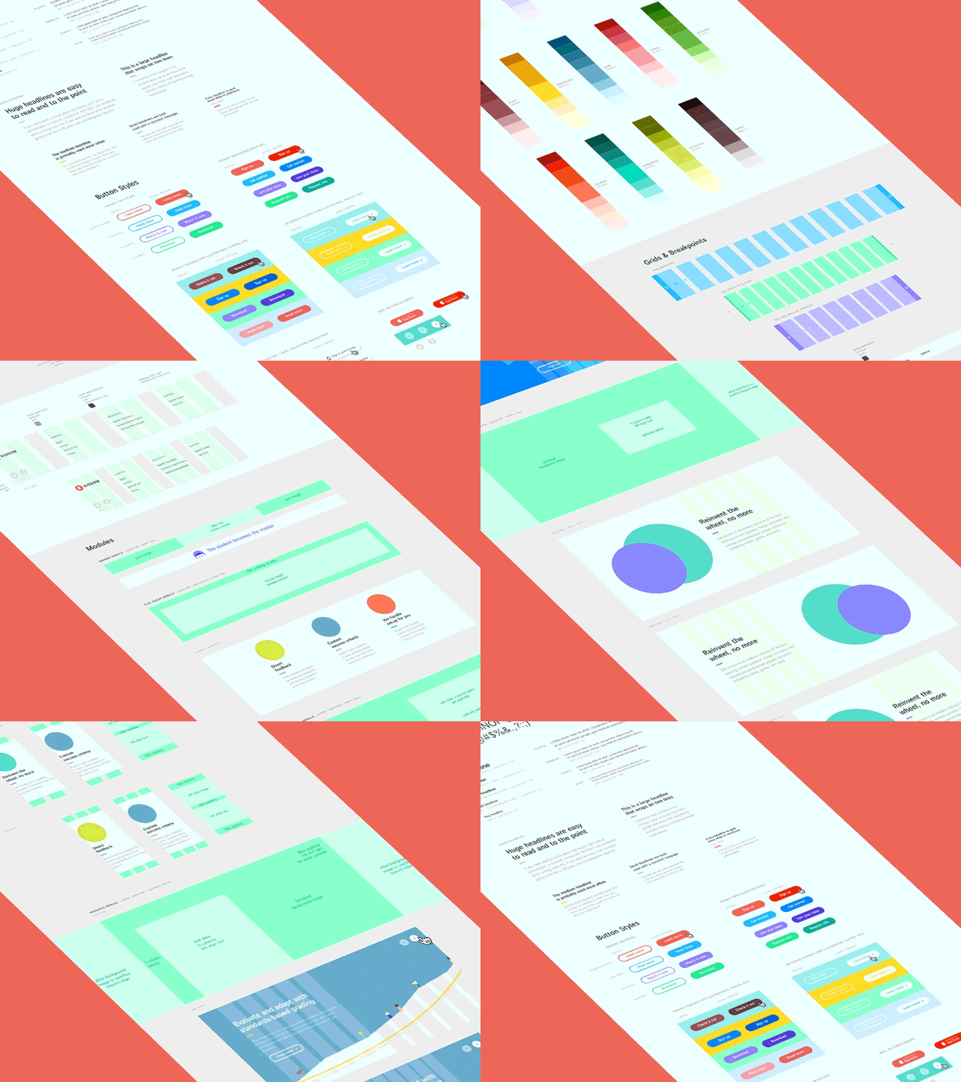
Kiddom - Big UI Style Guide
Here's part of a super extensive web style guide I worked on recently. This was part of a larger rebranding project I led over the course of a couple months. The client and I opted to create a modular system for their marketing pages, with different sized components, that worked in both web and mobile layouts of the website.
Challenging, meaningful, and interesting. My favorite combination of left and right brain projects ☻
More by Kiddom View profile
Like


