Box Office King - Choose a movie - round 2
Thanks to everyone online and offline for the great feedback. Such a great community on here.
The list of tweaks:
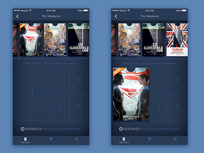
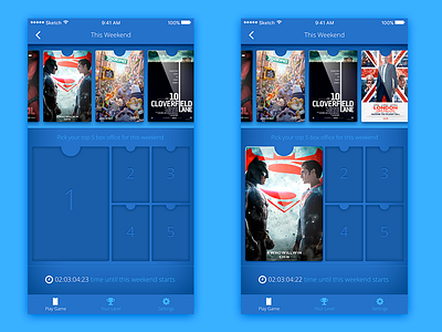
Toned the color way down. I started with a neutral blue and added back some of the saturation so the blue wasn't totally neutered of energy.
Added the "NEW" orange banner on the new releases.
Tweaked the copy in the middle to be clearer.
Brought down the contrast on all the shadows and edges so everything blends smoother. Even eliminated extra shadows in some cases.
Full pixels are in the attachments. Enjoy :)
More by Jonathon Juvenal View profile
Like


