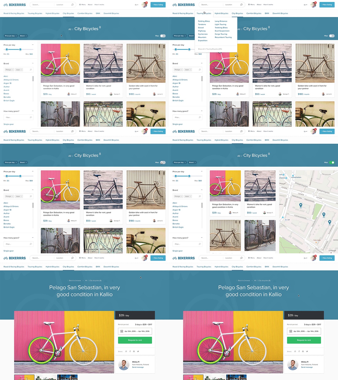
Feedback wanted in InVision – Sharetribe's new browsing UI
Hi guys,
I would love to hear you feedback regarding our new UI for the Sharetribe's marketplace's browsing and listing view. We have been working on this for quite a while now. We sent the same prototype to hundreds of marketplace owners to hear their feedback and it has been valuable to us. Now it’s the designers turn :)
Bit information about the project;
You can create your own peer-to-peer marketplace with us, and we currently support following marketplace types; selling products & services, renting products and classifieds.
Some design challenges;
- Marketplace admin can choose a main theme color and the accent color for the marketplace (the blue one in this case)
- Category and subcategory amounts vary a lot, one marketplace doesn't have any categories than other has 12 main categories and 30 subcategories on each. We need to provide the best UI for both scenarios and anything in between, without compromising the visual appeal.
- How to create visually different marketplaces stand out from rest of the marketplace, even if they are all using our platform?
- We currently have marketplaces from 50 counties, localization is important to use. We need to make sure the translations fit and the listing prices vary from 5 dollars to millions of rupiah.
Here's the InVision link; https://invis.io/R96XO84AT (feel free to comment as much as you want, all feedback is welcome :)
Thanks for your time, high fives!
Janne from Sharetribe
