WIP 3
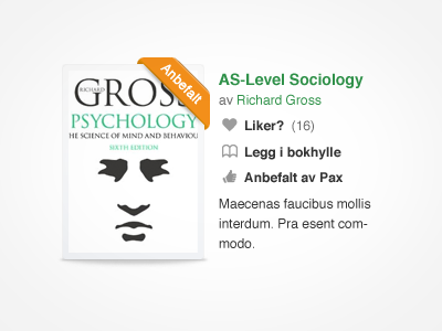
Inspired by Dribbble. Changed the Like icon to a heart, and using the thumb for the books that are recommended by the publishers. I might get away with using grey for links here because they have icons. But maybe they could appear disabled. Usability wise its not that smart to use grey or black for links. Comments? Im struggeling a bit here :)
More by Gunder Bruun Eriksen View profile
Like

