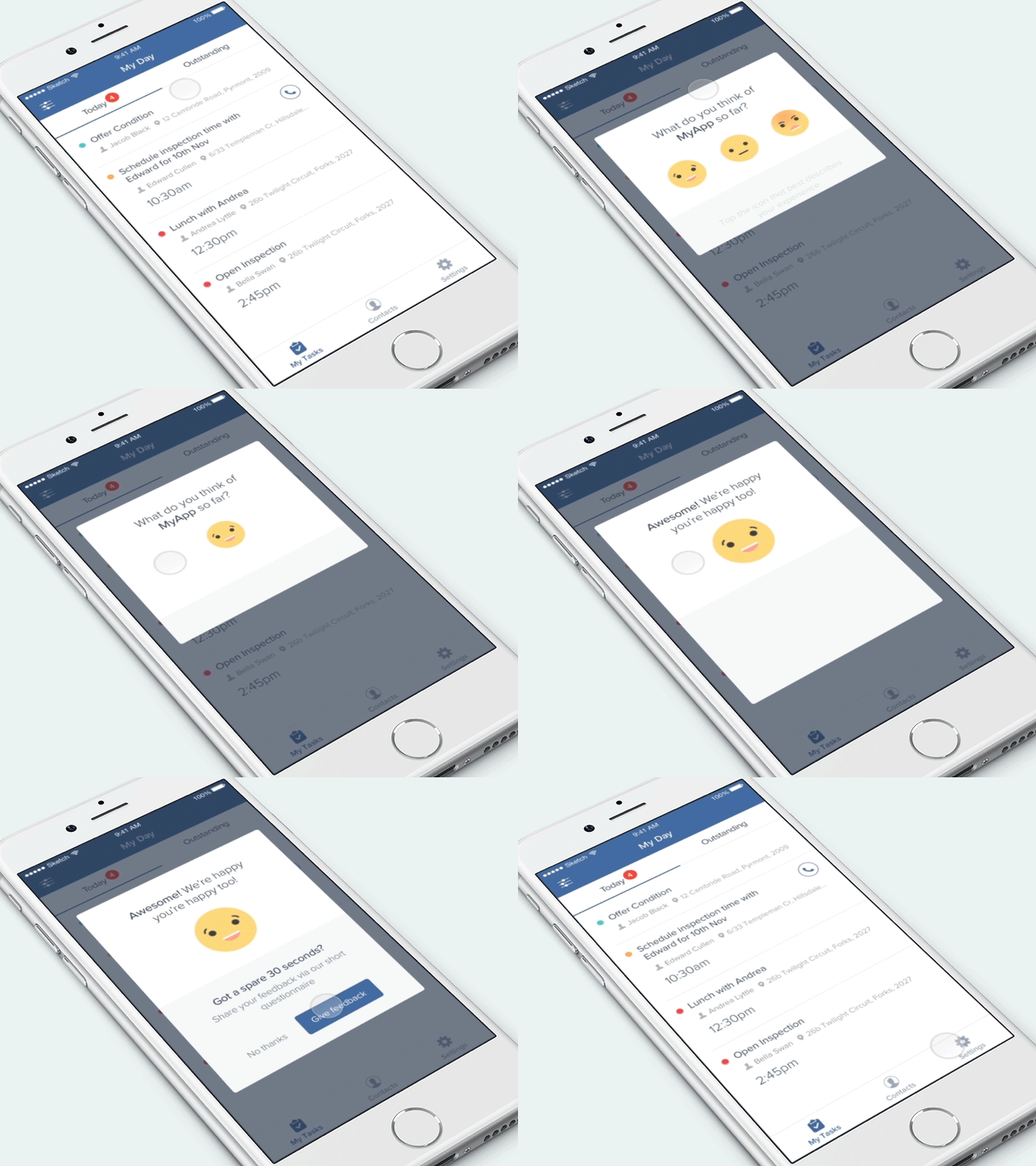
Feedback Interaction Animation
Following on from a talk I gave last week on the importance of user feedback in the design process, here’s an interaction prototype I designed for a feedback dialog on the iOS platform.
Our particular product release has been out for just over 1 month, and now it’s time to have a select amount of users give us feedback around
a. How they feel using the current experience b. If they've had any positive/negative experiences thus far
I designed a set of simplistic “Emoji” inspired illustrations for the initial rating process, because 100% of people I put a prototype in front of made a stronger connection with them over a simplified, stroked smiley. This is because we use Emojis in every day life, on Slack, Facebook, Twitter, Messenger, the list goes on.
The subtle animation interaction makes the experience fun, delights the user and research suggested would give a slightly better chance for the user to continue on with phase 2 of the feedback process - providing a textual form of feedback.
This feedback dialog is currently being built and we can’t wait to ship it and harness the power of user feedback.
