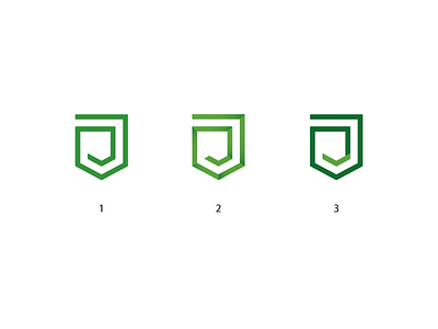
Wip. I need your help
Hello! The client chose the option with a shield and a check mark at the end. Now, he wants to have this check mark was clearly visible, as at the moment it can not be read. I tried a lot of options, but they do not look aesthetically pleasing, in my opinion. Can you please tell how to do better? And which version of the proposed better?
More by Ivan Shaikhislamov View profile
Like
