Karl Grohmann monogram and wordmark logo design
My client wanted a logo design that he could use for all of his multimedia. He was open to design ideas, but had wanted a wordmark for his name for some time. He liked artistic design and detail with a bespoke heritage look. He also liked symmetrical, Wes Anderson typefaces.
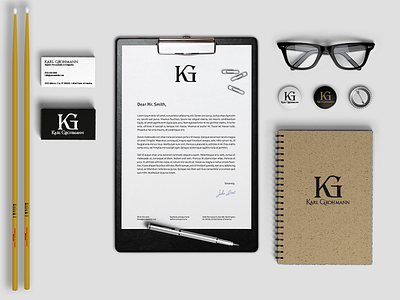
I designed the logo in Adobe Illustrator focusing on a decorative typeface for the monogram initials that evoked signage and engravings from the 1900s. The name typeface adds a modern pairing that still pairs well with a vintage style while adding a contemporary feel.
