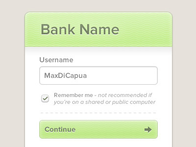
Why so ugly!?
Video attached shows a lot more detail
Why does online banking have to be so ugly? Been reading up on form design and general user experience a lot more recently so wanting to put some into practice.
For that reason any suggestions on improving it would be massively appreciated. Hopefully I'll get the time to continue this into the full dashboard etc.
video.mp4
300 KB
More by Max Di Capua View profile
Like

