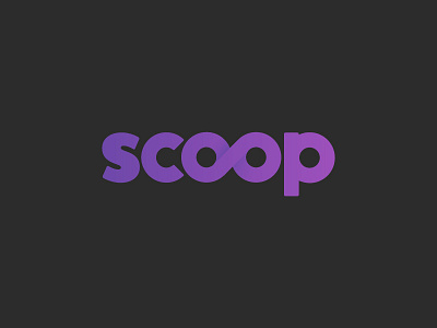
Scoop alternative version
Hi Dribbble,
Today I want to post the alternative version for Scoop logo.
I thought maybe infinite symbol is a bit "overused" and since this logo is for "managing numbers" app, the double O is inspired by the percentage symbol.
Here is the first version
What do you guys think?
More by Alberto Martinez View profile
Like
