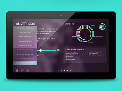
Profiler - Data visualisation
Whaddup - Here's some concept screens from a recent app I did. The idea was to break away from the usual bar graphs by using interesting live data visualisation. The joy is finding the right style of chart to make your point more digestible. Cheers @Matt Thompson 👌 for the draft.
More by Rafe Burchell View profile
Like

