Shyp Anchor app Style Guide
At Shyp Design we believe in quality and consistency.
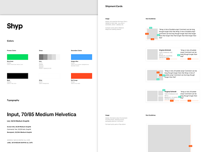
Every product we build is complemented by Style Guide where we collect all elements of UI as well as principles of designing the UI for this specific product. This is the Style Guide of Shyp Anchor app - the iPad app that is being used in our warehouse. I was responsible for updating the UX & UI for it, bringing consistency and system into visual design, aligning it with the Shyp brand.
It was extremely challenging and exciting project! One of the main challenges is the workflow - the Anchor app has to be fast, reliable, usable and consistent, only have the necessary information on the screen at any given point.
It took us a few months to completely redesign and re-build it and we're proud of how it turned out!
I had to strip out pieces of the Style Guide since it's huge but I'm showing some of the main elements here:
- colors (our brand colors)
- typography
- iconography
- inputs
- keyboards
- shipment cards (compact and full width)
- tags
Check out the full view of the Style Guide.
