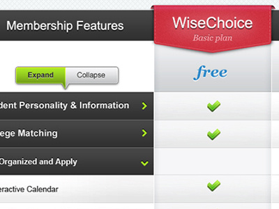
WiseChoice Pricing Table
There are a lot of membership features so I had to come up with a way to show all of them yet not make the page 6,000+ pixels long (literally).
The way this works is the categories that are different between the two packages are shown in the expanded menus. The categories that are same between the two packages are collapsed down automatically. So if the user still wants to see what the both packages offer for the same features they can expand them by clicking expand button to expand all of them at once or clicking on each heading area to expand that section.
it was the best method that i could come up with. Maybe there is another way? The screenshot has been resized slightly so it might of distorted some elements.
More by Ryan O. Hicks View profile
Like
