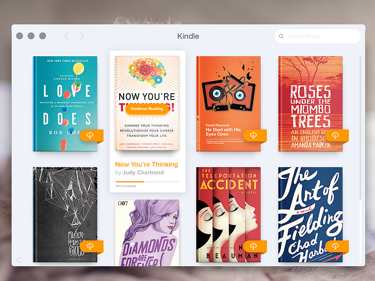
Kindle for OS X Redesign
Hey guys!
So I opened the Kindle desktop app for Mac OS X for the first time today in ages and felt the ui was in need of a bit of a refresh. I love the app but at times it just feels to clunky and messy.
I kept a similar layout and design direction and focused on decluttering the interface to make the app feel cleaner and more coordinated. I'm still working on the toolbar and other screens. Stay tuned for more pixels… cheers!!
Easter egg: The book cover on the lower left was redesigned by my typographic partner in crime Rachel Lindover.
More by Brandon Crooks View profile
Like
