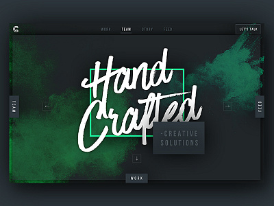
Green Chameleon Unused Home Screen
As we’re now getting stuck in to designing our new agency site I thought it might be a good time to show a couple ideas that definitely didn’t make the cut!
First up is this home screen concept, idea was to have a sort of multi-directional navigation between the core sections of the site all from the central home screen area. Still like some parts of this but generally felt it was a bit over the top.
More by Unseen Studio® View profile
Like

