Website — Christian Griffin
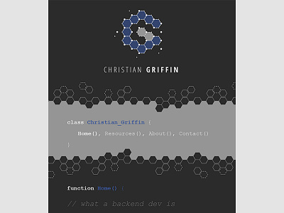
In addition to branding, I designed a new look and feel for Christian's personal portfolio site as well.
We went with a dark color scheme, and a monospace font to highlight his programming skill set. If you ask me, nothing screams developer more than a good monospace font.
More by Zach LeBar View profile
Like


