Life's A Pitch
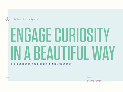
We recently had to pitch an idea for our final projects so I had fun with it and quickly worked up a few supporting slides to aid in delivery. We were limited to 1 minute so brevity was important.
The idea was to re-examine the design and experience of applications geared towards young children. As you can see in a few screen shots in the deck, most of these apps are visual trash that don't consider user experience or the flow of design. The result is obnoxious color and sound that overstimulates the kids and can add additional frustration to parents.
My thought is that kids deserve just as considered approach to tools as everyone else gets. With effort and consideration to the environments in which parents typically use their device to occupy their child's time I think this can be a better tool for learning and engagement.
