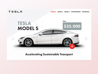
Landing Page
Just a quick mockup I did as a challenge at lunch today. I chose Tesla because they are obviously pretty awesome (and the cars look nice)
I used Futura as the font and tried sticking pretty close the the color scheme Tesla use on their current site.
Let me know what you think !
More by Daniel Benzie View profile
Like

