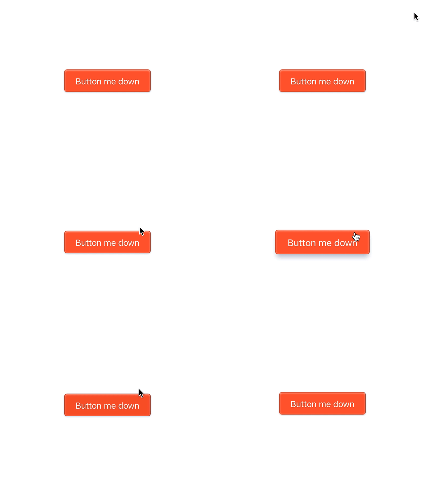
Crispy CSS Button
Decided to create a simple button in CSS.
On hover the button rises towards the user to encourage clicking in a friendly way. In its down state the button shrinks slightly to simulate being pushed away from the user and also moves down a few pixels.
Check out the live version on Codepen: http://codepen.io/lastminutemike/pen/xVXaWW
In the demo I've animate the box-shadow property which @Tobias Ahlin
has taught me not to do since it's more resource intensive (http://tobiasahlin.com/blog/how-to-animate-box-shadow/). However in this case Tobias's alternative method comes with some unwanted visual side effects. But since this isn't going to be used in any live site it's fine!
¯\_(ツ)_/¯
More by Mikael Johansson View profile
Like
