240 Infographic Rev2
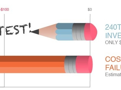
Repositioned the chart so that it reads as a cost savings, instead of dollars earned. Also turned the chart into a bit of a metaphor.
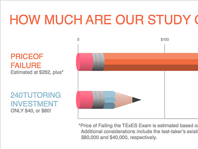
The bar representing the cost of client's product, is well used
while the bar representing the cost of failing the exam is an unsharpened, unused pencil.