Designing the Onboarding UX/UI for a Lifestyle App

My friend and I started building Cravings, an app that works to help you crave less. By quantifying your cravings, you create greater awareness of how much, how long, and/or how often you crave something. Like a meal log does for someone looking to practice healthier eating habits, we envisioned cravings to take the same approach. Once you've become aware of your craving through your own personal data, we then envisioned suggesting alternatives based on your indicated interests as a proactive approach to replace your cravings.
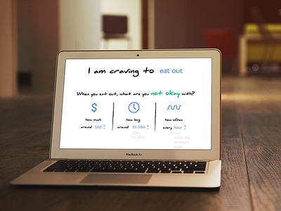
This design is one part of the initial Onboarding screens I designed for the app. High focus on designing for trust and delight.
I chose a handwriting font to create a personal human feel, and sans-serif font for readability on the editable elements (i.e. frequency, length, cost). Calm, cool and light colors to put user at ease and draw attention to key text elements/symbols that user needs to focus on.
To create a sense of balance, I applied a three-column layout for the three main quantities user needs to fill out, and centered text.
To visually represent "how much", "how long", and "how frequent", I carefully chose symbols that would resonate with the user.
I embraced white space to keep the onboarding process free of distraction, and focus the user on the important tasks at hand.